
Öffnungszeiten & Kontakt
Hellblaue Farben sind wie das sanfte Streicheln einer Feder auf deinen Augen, entspannend und erfrischend zugleich. Wir begegnen diesem Farbwunder täglich: im Himmel, im glitzernden Wasser und als schicke Wahl für unsere Outfits. Wir lieben Blau, aber zucken manchmal zurück, wenn es sich zu kühl oder distanziert anfühlt.
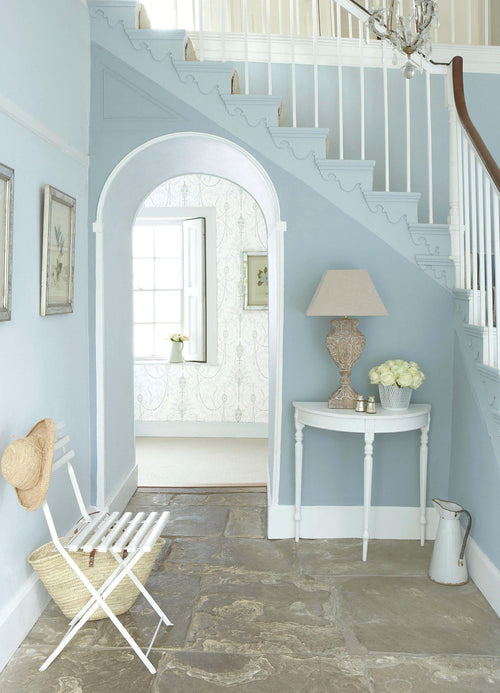
In einem blauen Raum ist die Position der Lichtquelle ein echter Gamechanger. Räume nach Süden oder Westen genießen am Mittag und Abend die kühle Brise, die das warme Licht abkühlt. Für östlich ausgerichtete Zimmer sind wärmere Farbtöne die bessere Wahl.
You have already found the right color. Or are you still not sure? Then claim your Little Greene today Color card set Colors of England and Color ...
View full detailsYou have already found the right color. Or are you still not sure? Then claim your Little Greene today Color card set Colors of England and Color ...
View full detailsYou have already found the right color. Or are you still not sure? Then claim your Little Greene today Color card set Colors of England and Color ...
View full detailsDie hellblauen Töne der Little Greene Farbpalette verpassen jedem Projekt den extra Kick. Unser klassisches Blue Verditer, ein mittelintensives Blau mit einer Prise Pigment-Zauber, harmoniert perfekt mit Pink Slip, French Grey Mid, knalligen roten Möbeln und einem Hauch von Gold – so wie im authentischen Farbschema von Robert Adam im Kenwood House.
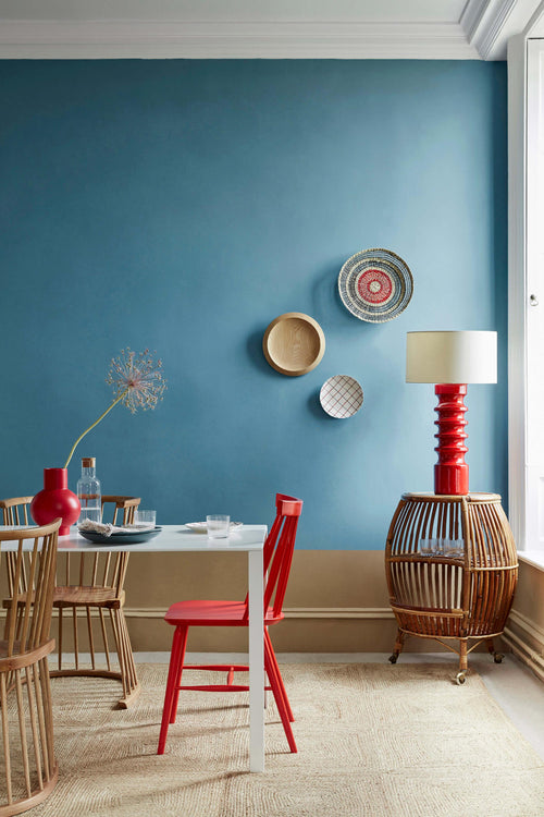
Wenn du es lieber kräftiger und lebendiger magst: Deep Space Blue, Smalt und Mazarine sind die idealen Kombipartner zu warmen Grautönen mittlerer Intensität wie French Grey Mid.
You have already found the right color. Or are you still not sure? Then claim your Little Greene today Color card set Colors of England and Color ...
View full detailsYou have already found the right color. Or are you still not sure? Then claim your Little Greene today Color card set Colors of England and Color ...
View full detailsYou have already found the right color. Or are you still not sure? Then claim your Little Greene today Color card set Colors of England and Color ...
View full detailsYou have already found the right color. Or are you still not sure? Then claim your Little Greene today Color card set Colors of England and Color ...
View full detailsYou have already found the right color. Or are you still not sure? Then claim your Little Greene today Color card set Colors of England and Color ...
View full detailsYou have already found the right color. Or are you still not sure? Then claim your Little Greene today Color card set Colors of England and Color ...
View full detailsYou have already found the right color. Or are you still not sure? Then claim your Little Greene today Color card set Colors of England and Color ...
View full detailsYou have already found the right color. Or are you still not sure? Then claim your Little Greene today Color card set Colors of England and Color ...
View full detailsYou have already found the right color. Or are you still not sure? Then claim your Little Greene today Color card set Colors of England and Color ...
View full detailsYou have already found the right color. Or are you still not sure? Then claim your Little Greene today Color card set Colors of England and Color ...
View full detailsDie angesagten gedämpften Blautöne sind echte Allround-Talente, vor allem mit ihrer Prise Grau. Hicks‘ Blau ist ein knalliges, außergewöhnliches Blau, das in jedem Zimmer glänzt und in Kombination mit French Grey, Bath Stone, Bone China Blue Mid oder Loft White für eine neue Überraschung sorgt.
Auf der anderen Seite zaubert Celestial Blue, ein himmlisches Blau mit einem Hauch Grün, eine entspannte Stimmung ins Wohn- und Schlafzimmer und sorgt für dramatische Akzente, wenn es mit einem kräftigen Blauton kombiniert wird.
You have already found the right color. Or are you still not sure? Then claim your Little Greene today Color card set Colors of England and Color ...
View full detailsYou have already found the right color. Or are you still not sure? Then claim your Little Greene today Color card set Colors of England and Color ...
View full detailsYou have already found the right color. Or are you still not sure? Then claim your Little Greene today Color card set Colors of England and Color ...
View full detailsYou have already found the right color. Or are you still not sure? Then claim your Little Greene today Color card set Colors of England and Color ...
View full detailsYou have already found the right color. Or are you still not sure? Then claim your Little Greene today Color card set Colors of England and Color ...
View full detailsYou have already found the right color. Or are you still not sure? Then claim your Little Greene today Color card set Colors of England and Color ...
View full detailsYou have already found the right color. Or are you still not sure? Then claim your Little Greene today Color card set Colors of England and Color ...
View full detailsYou have already found the right color. Or are you still not sure? Then claim your Little Greene today Color card set Colors of England and Color ...
View full detailsYou have already found the right color. Or are you still not sure? Then claim your Little Greene today Color card set Colors of England and Color ...
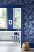
View full detailsTauche ein in die Welt der intensiven Blautöne! Von Royal Navy über Dock Blue bis hin zu Basalt - perfekt für ein gemütliches Ess- oder Arbeitszimmer. Oder wie wäre es mit Hicks' Blue für einen Hauch von Raffinesse? Wenn es etwas lebhafter sein soll, ist Smalt die perfekte Wahl - ideal für Küchen und Räume, die vor Energie strotzen! U
nd vergiss nicht die Eingangstüren - intensive Blautöne sind hier der Hit und verleihen jedem Eingangsbereich einen eleganten Touch. Basalt und Dock Blue sind besonders beliebt für ihre stilvolle Kombination mit Chrom- und Messingbeschlägen.
You have already found the right color. Or are you still not sure? Then claim your Little Greene today Color card set Colors of England and Color ...
View full detailsYou have already found the right color. Or are you still not sure? Then claim your Little Greene today Color card set Colors of England and Color ...
View full detailsYou have already found the right color. Or are you still not sure? Then claim your Little Greene today Color card set Colors of England and Color ...
View full detailsYou have already found the right color. Or are you still not sure? Then claim your Little Greene today Color card set Colors of England and Color ...
View full detailsYou have already found the right color. Or are you still not sure? Then claim your Little Greene today Color card set Colors of England and Color ...
View full detailsYou have already found the right color. Or are you still not sure? Then claim your Little Greene today Color card set Colors of England and Color ...
View full detailsYou have already found the right color. Or are you still not sure? Then claim your Little Greene today Color card set Colors of England and Color ...
View full detailsYou have already found the right color. Or are you still not sure? Then claim your Little Greene today Color card set Colors of England and Color ...
View full detailsYou have already found the right color. Or are you still not sure? Then claim your Little Greene today Color card set Colors of England and Color ...
View full detailsYou have already found the right color. Or are you still not sure? Then claim your Little Greene today Color card set Colors of England and Color ...
View full detailsYou have already found the right color. Or are you still not sure? Then claim your Little Greene today Color card set Colors of England and Color ...
View full detailsYou have already found the right color. Or are you still not sure? Then claim your Little Greene today Color card set Colors of England and Color ...
View full detailsYou have already found the right color. Or are you still not sure? Then claim your Little Greene today Color card set Colors of England and Color ...
View full detailsYou have already found the right color. Or are you still not sure? Then claim your Little Greene today Color card set Colors of England and Color ...
View full detailsYou have already found the right color. Or are you still not sure? Then claim your Little Greene today Color card set Colors of England and Color ...
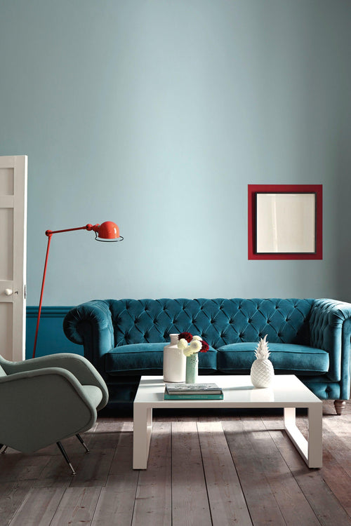
View full detailsViele schrecken vor Blau zurück, da es als kalt verschrien ist. Andere sehen es jedoch als warm und beruhigend. Der derzeitige beliebte Trend zu intensiven gedeckten Blautönen verleiht eine Ruhe und Behaglichkeit, die viele andere Farben oft nicht bieten können.
Basalt – ein dunkles Blau, fast schon ein Schwarz – ist für Wände zum Standard geworden. Auch graue Blautöne haben sich hier bewährt, wobei Hicks‘ Blue hier am beliebtesten ist. Diese satte blaue Farbe ist äußerst angenehm, da es sich um einen warmen und sanften Farbton handelt, der sich gut mit Grüntönen (Green Verditer) und Gelbtönen (Bath Stone) kombinieren lässt. Blasse Blautöne lassen einen Raum größer erscheinen.
Probiere Celestial Blue als angenehme, raffinierte Farbe aus, die stets ansprechend wirkt, da sie so gut zu anderen Farben und Dekorationen passt


