
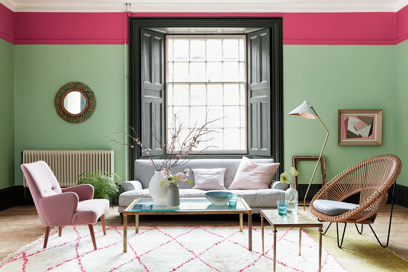
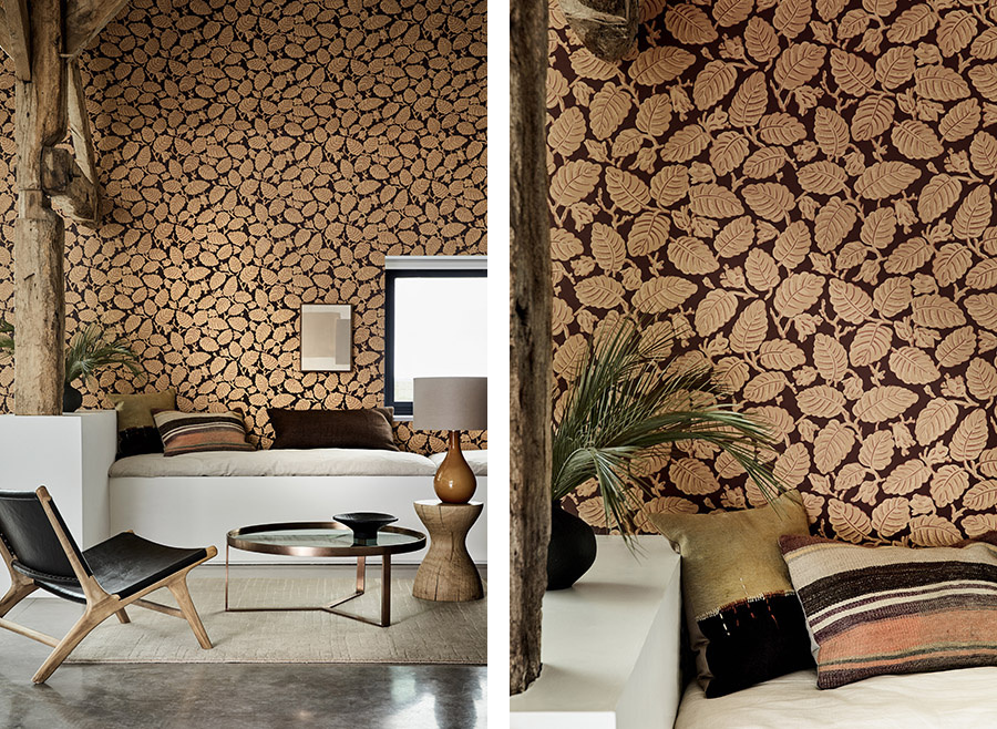
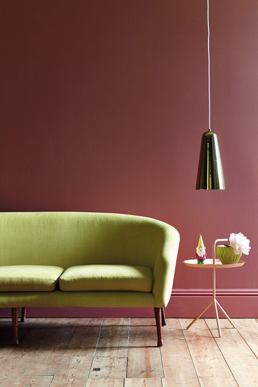
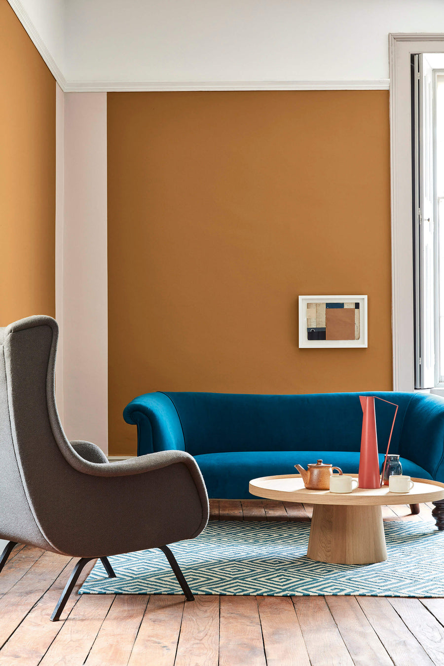
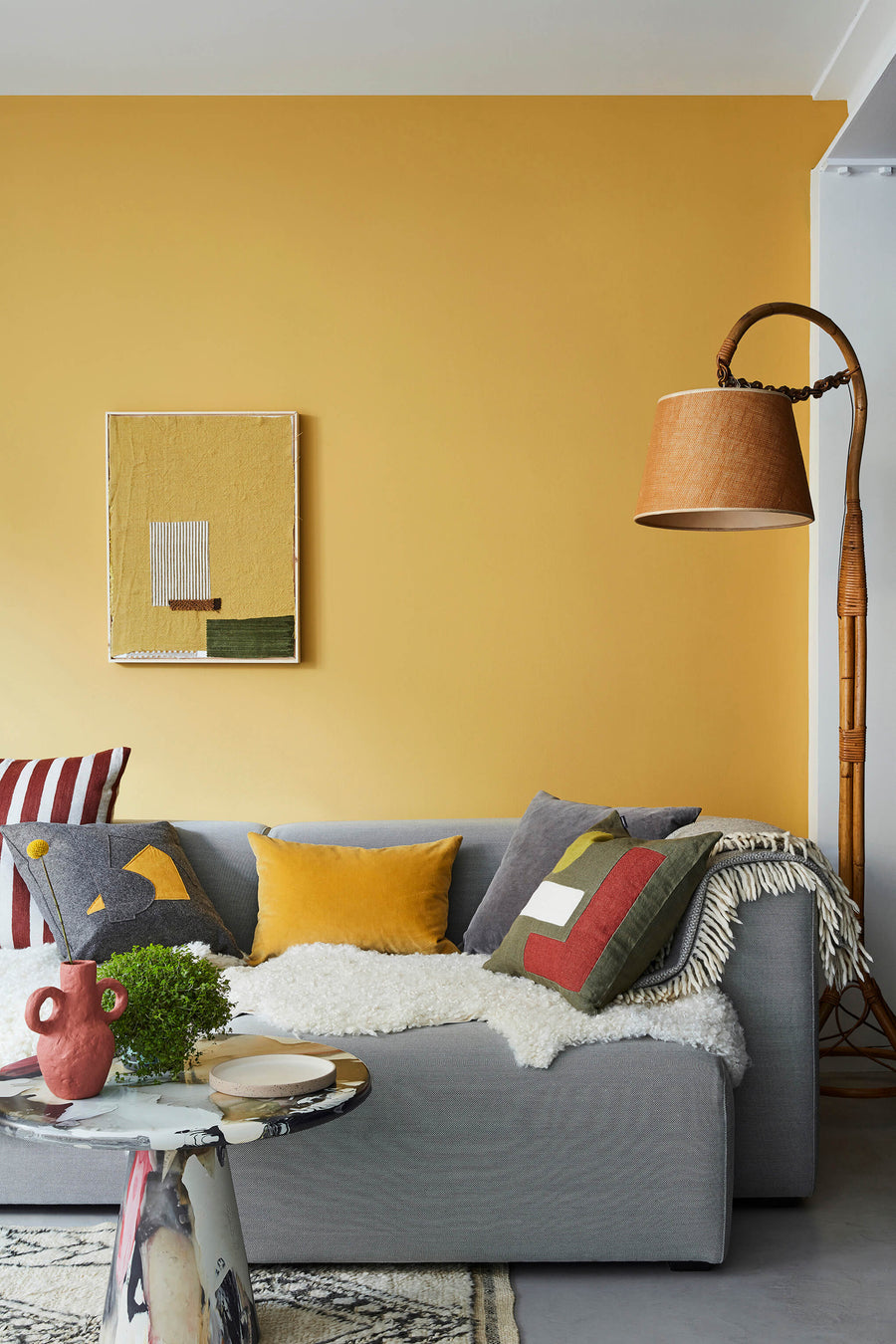
Wohnzimmer aus Leather und Pea Green
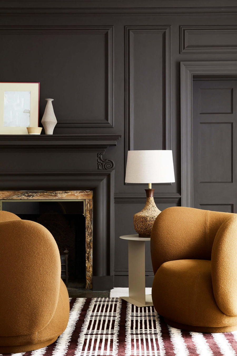
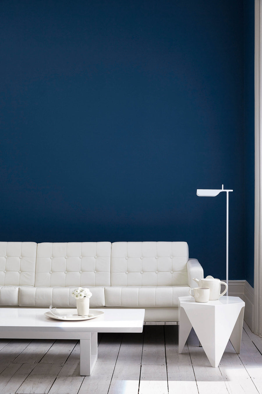
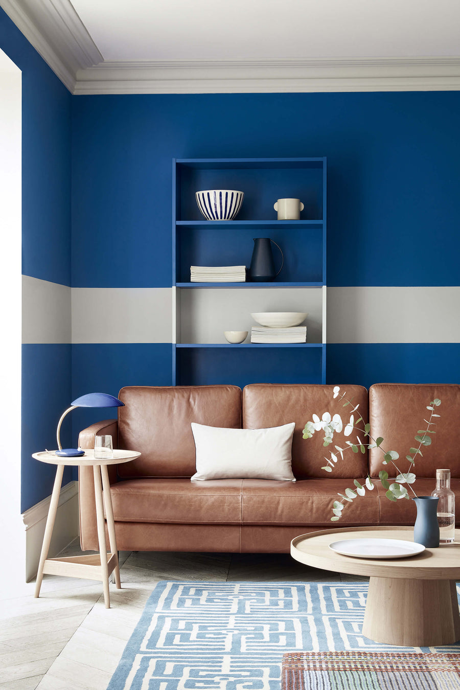
4 Farben, die in Kombination perfekt in dein Wohnzimmer passen:
4 Farben, die in Kombination perfekt in dein Wohnzimmer passen:
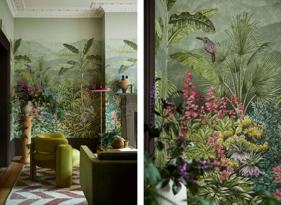
Dieses Wandgemälde ist von historischen Wandpaneelen aus dem frühen 19. Jahrhundert von Velay und Zuber inspiriert und wurde von Hand neu gemalt, um die idealisierte und stereotypische Darstellung von Landschaften wiederzugeben, die damals als romantisch oder exotisch galten. Verteilt über drei Bahnen zeigt diese zeitgenössische Interpretation ein üppiges Panorama mit Affen und tropischen Vögeln. In vier Farbvariationen erhältlich bringt diese Tapete Dynamik und einen spannenden Blickfang in jeden Innenraum.
Dazu passen die Farben:
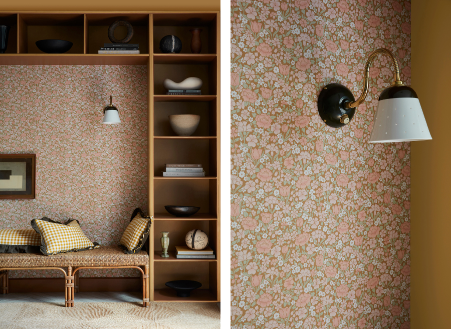
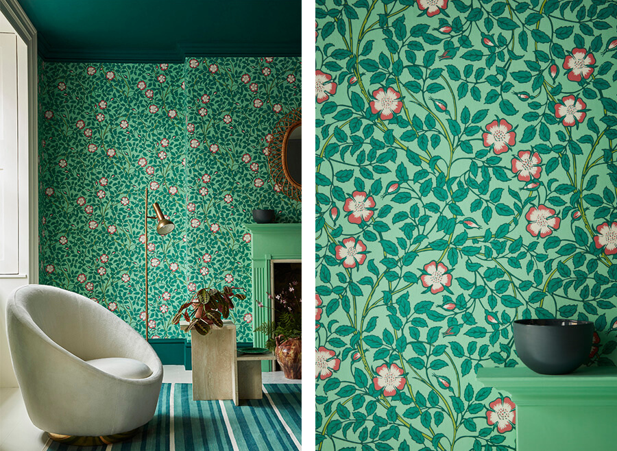
Standen House in West Sussex ist eines der besten Beispiele für ein Arts & Crafts Haus in England, entworfen von Philip Webb mit Interieurs von William Morris. Dieses von einer Vielzahl von Frühlingsblüten geprägte Design zeigt, wie Designer der damaligen Zeit von Blumen und Blättern inspiriert waren und wie sie diese Formen stilisierten, um die Natur ins Innere zu holen. Das erhaltene Original dieser Tapete ist in einer monochromen Farbvariante in Blau und Weiß gehalten, aber sonst ist wenig über die Geschichte dieses speziellen Designs bekannt. Jetzt in sechs unterschiedlichen Farben erhältlich, mit zwei sanften Neutralen und mit vier kräftigeren Hintergründen.
Dazu passen die Farben:
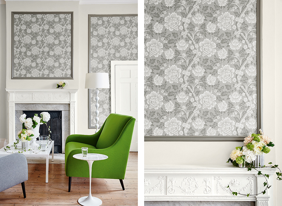
Ein eleganter Blumenweg mit raffinierter Farbvariation – über die Geschichte dieser Tapete ist wenig bekannt, aber es stammt wahrscheinlich aus dem Ästhetizismus des späten 19. Jahrhunderts. Das Muster imitiert ein gefliestes Mosaik und erzielt einen charmanten, lockeren Abschluss mit subtilen Schattierungseffekten. Das Design wurde dem Original entsprechend in vier eleganten, abgestuften Farbvarianten im Oberflächendruckverfahren reproduziert, um den Mosaik-Effekt nachzubilden und die Textur und Tonalität der Farben zu verbessern.
Dazu passen die Farben:
Diese Tapete wurde ursprünglich vom Kinderbuchillustrator Walter Crane designt und wird aufgrund der dicht stilisierten natürlichen Motive dem „Arts and Crafts“-Stil zugeordnet. Viele der Zeichnungen von Walter Crane wurden zu Kinderzimmertapeten und „Briar Rose“ wurde ursprünglich als Hintergrund für eine Tapete mit dem Namen „The Sleeping Beauty“ eingeführt, die zwischen den Rosen Personen aus dem Märchen Dornröschen zeigte. Sie wurde in der Oxburgh Hall gefunden, doch man weiß nur wenig darüber, wo im Haus sie genutzt wurde, da die meisten Originale heute nur als lose Muster vorliegen. Die Tapete wurde ursprünglich vom Londoner Unternehmen Jeffrey & Co. produziert und nun in drei sanften Farbkombinationen und drei leuchtenden Farbstellungen reproduziert.
Dazu passen die Farben:
Dieses Design weist Kniphofia-Blumen auf, die auch als Fackellilien und Raketenblumen bekannt sind. In den Büchern wurden sie als handgemalt aufgeführt und sollen als maßgefertigte Dekoration über einer bereits tapezierten Wand in einem Haus aus dem späten 18. Jahrhundert in der Upper Brook Street angebracht worden sein. Als natürlichen Hintergrund zu den Fackellilien hat Little Greene ein Motiv seiner Stag-Toile- Tapete verwendet.
Eine passende Farbe hierzu ist:
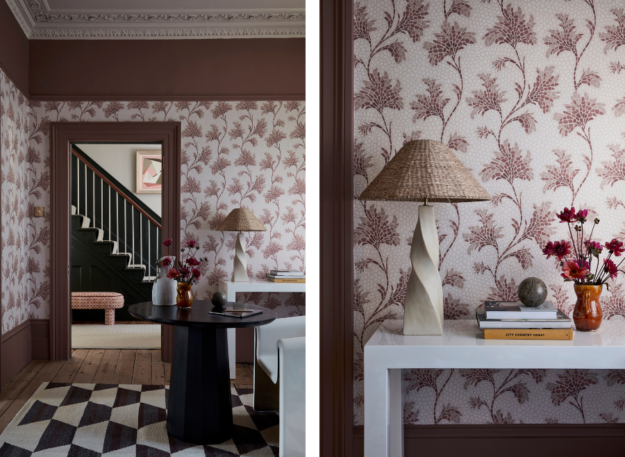
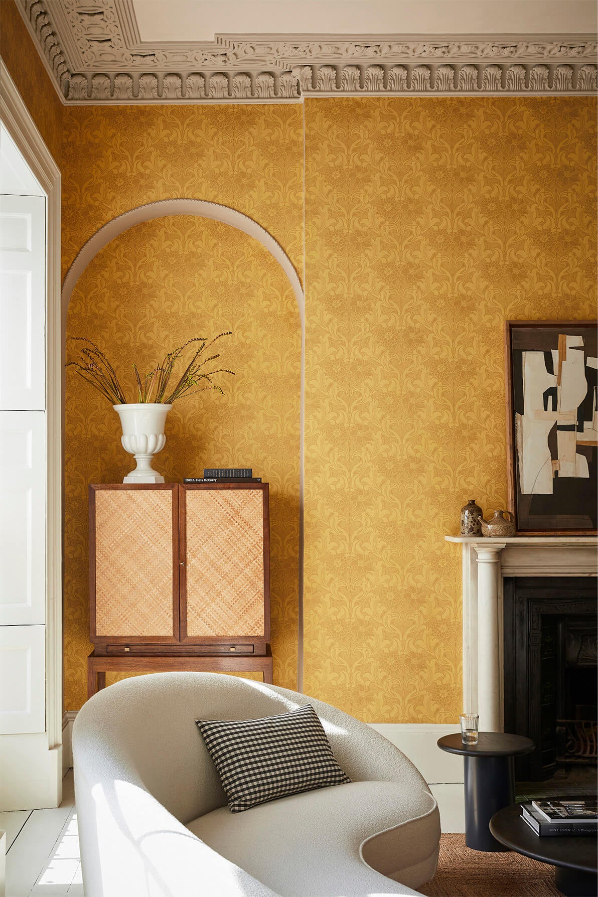
Gustav (ca. 1875) wurde in einem schlechten Zustand aufgefunden, was die Datierung recht schwierig macht, doch die Archivare von English Heritage schätzen, dass es Mitte des 18. Jahrhunderts entstanden ist. Gefunden wurde es im Eagle House, einem jakobinischen Herrenhaus in Wimbledon. Es trägt die Merkmale eines klassischen Blockdrucks, doch tatsächlich wurden einige der Blumen auf dem Original von Hand auf die vorgedruckten Ranken gemalt, die Teil einer dekorativen Borte bilden. Die Größe des Musters erinnert an große Damast-Designs, doch durch die gedämpften Farben, die man für die „Archive Trails“-Adaption gewählt hat, kann diese Tapete rundum verwendet werden, ohne einen Raum zu sehr zu dominieren.
Passende Farben dazu wären:
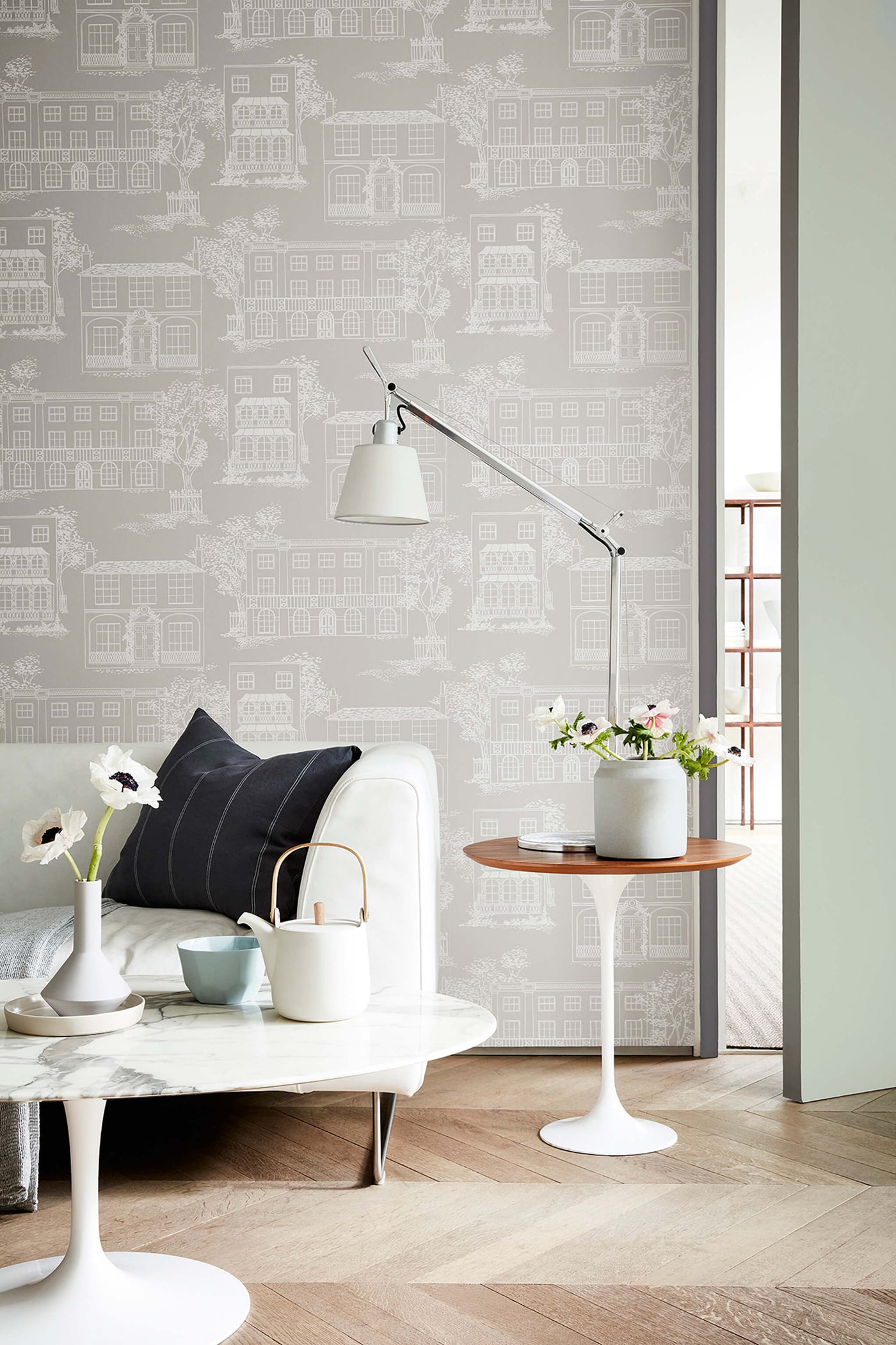
Diese entspannte Interpretation aus einer Stadtszene aus Hampstead stammt aus der handbedruckten „Apsley Collection“ von John Line & Sons und wird dem Designer Els Calvetti zugeschrieben. Die gesamte Linienstruktur wurde beibehalten und die Original-Farbkombination in grau und blau sorgfältig an das Innendekor des 21. Jahrhunderts angepasst.
Die passenden Farben sind:
Ursprünglich in einer bunten, geflockten, floralen Bordüre verwendet, wurde das Blatt- und Nusselement in einer eher gedämpften grauen Farbgebung im Blockdruckverfahren hergestellt. Die sechs zeitgenössischen Interpretationen sind zwar deutlich farbenfroher, verwenden aber alle eine ähnlich ausgewogene Farbpalette und die charakteristische, handwerkliche Textur eines oberflächenbedruckten Papiers.
Die passenden Farben wären:
Diese Tapete, eine Überarbeitung eines authentischen französischen Damasts aus dem 19. Jahrhundert, wurde kürzlich als lackiertes Kunstwerk in einer Atelierwohnung in Paris gefunden. Es ist ein verbreitetes Missverständnis, dass die in historischen Dekorationen verwendeten Farben ausschließlich düster waren. Die hier reproduzierten satten Farbtöne, -schichten und -abstufungen stimmen genau mit den Originaltapeten überein und sorgen doch für eine sehr moderne Atmosphäre.
Im Gegensatz zu den meisten Ausgangsmaterialien für Little Greene Tapeten ist dieses Design keine Nachzeichnung eines konventionellen Musters, sondern eine Neuinterpretation eines Gemäldes aus der Mitte des 20. Jahrhunderts. Es repräsentiert die Vorliebe der gehobenen Gesellschaft für handgemalte Wandgemälde, die der Vorläufer kommerzieller Tapeten waren. Die feinen Details des Originalgemäldes in Kombination mit diesem 3-teiligen Panel-Design zeigen ein florales Rankenmuster, welches das Feingefühl eines bildenden Künstlers zeigt. In vier Farbkombinationen erhältlich.
Eine passende Farbe wäre:
Die Quelle dieses Designs war ein typischer historischer Damast, ein gewebter Seidenstoff aus dem 19. Jahrhundert, dessen Wirkung mit dem Druck repliziert wurde. Wie bei dem Design High Street aus London Wallpapers III findet man dieses Muster an mehr als einem Standort, woraus sich schließen lässt, dass es bereits ab dem 18. Jahrhundert bis Ende des 19. Jahrhunderts in beträchtlichen Mengen hergestellt worden sein muss. Dies entspricht auch den industriellen Produktionsmöglichkeiten zu dieser Zeit.
Die passenden Farben wären:
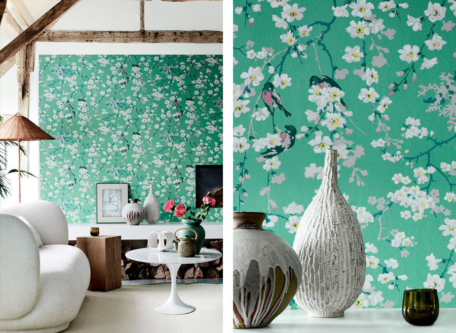
Dieses Muster wurde – in einer Zeit vormoderner künstlerischer Sensibilität – als naturverbunden, einfach und harmonisch angesehen. Die schleppende Blüte und die sich wiederholenden Vögel sind Elemente, die in der frühen handgemalten Chinoiserie häufig zu finden sind. Durch die Verwendung des traditionellen Flächendrucks erhält die Tapete Struktur, was dem anspruchsvollen Auge subtil mehr bietet als ein konventionell in Massenproduktion hergestelltes Papier.
Eine passende Farbe dazu wäre:
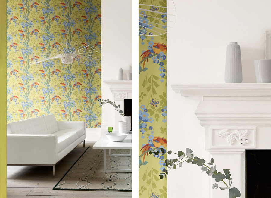
Ein oberflächenbedrucktes Design mit exotischen Lori-Vögeln und einer orientalischen Blüte. Es wurde von einem eindrucksvollen Kunstwerk aus dem 20. Jahrhundert inspiriert, das in der Whitworth Art Gallery in Manchester ausgestellt ist. Das exotische Thema und die fast symmetrische Wiederholung sind typisch für Designs aus den 1930er Jahren. Sie spiegeln die Sehnsüchte nach Reisen in ferne Länder wider und waren für die Besucher des Hauses ein Zeichen des Reichtums.
Obwohl sie für heutige Einrichtungen farblich neu gestaltet wurden, sind die ausgewählten Farbgestaltungen ein Zeugnis für den Gebrauch von leuchtenden Farben, die man in den 1930er Jahren häufig verwendete. Aus diesem Grund mag der Lori als Thema gewählt worden sein. Die Tapete ist in fünf Farbkombinationen erhältlich.
Dazu passend:
Ein Blumenrankendesign, das an das Frühwerk von Voysey erinnert. Diese zweifarbige Tapete zeigt eine vergrößerte Dahlie, ein Motiv, das sich oft in japanischen Designs findet, während die geschwungenen Formen der Pflanze, die von einer einzigen Blüte ausgehen, auch für den Jugendstil charakteristisch sind. Dieses Muster ist in sieben unterschiedlichen Farbstellungen erhältlich, darunter in eleganten neutralen Tönen, in sattem Blau und in leuchtendem Gelb, und wurde ursprünglich wahrscheinlich von Jeffrey & Co. blockgedruckt.
Das passen die Farben:


